Repository navigation
Formatting: Increased size of page content section headings. - #249
Conversation


|
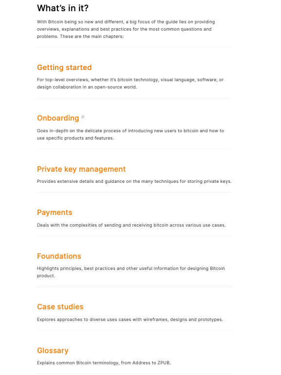
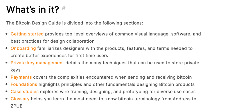
@Bosch-0 actually I shouldn't have merged this one probably, because the #220 lists these sections in a different way. With #249
Witth #220
Which one do we prefer? I kinda prefer concise list vs headings which to some may not be that obvious are clickable. I'll rebase if we agree to go with whatever. |

|
I have conflicting thoughts. The extended one worked much better with 3-4 lines of text, otherwise it's too airy. However, the bullet list is a bit too condensed. Might be ideal to keep your update and revise the spacing via #231 (which seems to become more urgent as we add more content)? |

|
I'm more in favor of the headings. Agree with GBKS dot points look too condensed. In hierarchical terms using dot points makes it look lower, this list is the main content on this page and should be more prominent as @danielnordh mentioned in the comment link in OP. If we were use dot points here it would make sense to also change all the other section overview lists to this styling to keep consistency. I agree that the spacing could be decreased above the heading between the break, it should match the spacing between the body text and the break. I didn't touch that part of things in this PR as #231 is addressing that and it isn't a simple fix. We could remove the break and decrease margins to get a style like below:
|


|
The left picture looks good to me. |


Increased size of page content section headings. They looked too small before, especially on mobile. Below is before and after for desktop and mobile:
Also added the coming soon pages for onboarding in this PR.